
AmLaw Global 50 Aggregate Scores
| # | Score | Description |
|---|---|---|
| 1 | 98.0 | Global and local navigation styles are consistent. Visitor does not have to relearn new styles throughout site. |
| 2 | 88.1 | Easy to navigate across multiple devices; navigation remains intuitive and easy to use regardless of device |
| 3 | 99.8 | Each page has a unique URL and enables visitors to go back to the immediate past page |
| 4 | 93.6 | Navigation titles, links and buttons describe exactly what's inside after a visitor clicks |
Top Trends + Insights
17 Global 50 firms scored 100.0 on FBP3 - Navigation, with 26 more firms scoring “excellent.” The seven remaining firms scored “good,” with 80.0 being the lowest score. Since the early days of our AmLaw 100 websites research in 2005, 2006, and 2007, this Foundational Best Practice has improved more than any other. Your visitors are grateful!
Consistency of global and local navigation styles improved considerably over the 2016 Study, where firms scored 84.0 compared to 98.0 in 2019.
In the latest round of redesigns, it is much easier to navigate across multiple devices and have a seamless and intuitive experience. Firms scored 88.1 (“excellent”) in the 2019 Study and 64 (“fair”) in 2016.
With the proliferation of hamburger menus, we are observing a trend that local page-specific navigation is disappearing – not a good trend in our view. Eliminating it prevents visitors from traveling horizontally through your site. In other words, it means they have to jump vertically to the hamburger menu, open it and then click to the next global navigation title, rather than easily careening across your site to another practice page or news item. Is this a reason that visitors are viewing fewer pages per visit than they did in 2016? It’s perhaps a contributor.
Reminder: the purpose of navigation is to help people find their way around websites – to get them from point A to point B as quickly and easily as possible.
Attributes #3 and #4 for FBP3 - Navigation were added in 2019, replacing two others that were no longer critical as a Foundational Best Practice. We are pleased to see that all the Global 50 firms scored well on them.
Navigation on most sites was consistent from desktop to tablet to phone, but several firms had design issues with over-crowding hamburger navigation buttons on phones, making easy navigation difficult.
Another issue, which is both a design and navigation problem, relates to desktop page design that is essentially duplicated on phones. The phone result is visual clutter and a loss of clear information hierarchy. The phone experience should be equally clean, airy and uncluttered as the desktop journey.
It was surprising that a few websites in the Global 50 had disappointing phone experiences because they chose imagery with a fixed size. This means that on some smaller phones, the image dominated the page to a point that it was hard to navigate beyond it. Designers: don’t use images with fixed pixel sizes.
Some firms cause visitor confusion (still) by choosing less common navigation titles. Designers and planners want the product they create to be “different,” without recognizing (or caring) that buyers of legal services have an expectation of what they will get on a law firm website. Don’t do this. Just don’t. These firms are consciously or unconsciously obstructing the visitor experience and wasting their time. Don’t delay visitors getting what they want and need to evaluate you.
Mega-menus, which became wildly popular and helpful in 2010 and beyond, are rapidly disappearing with hamburger menus taking over. It’s hard to argue with the fact that they are useful in short-cutting the time to find what a visitor wants. Because CMS doesn’t use a hamburger menu, it is a terrific example of a mega-menu that works hard to deliver.
Whether you are using a hamburger menu or a traditional list of global navigation titles, avoid including too many. A list of 10 across the top and 15 in the hamburger menu on a mobile site is excessive. Work on improving the information hierarchy within your taxonomy and be more critical in what rises to the top of your navigation structure.
While we are seeing fewer and fewer tabs used on lawyer bios and practice pages, a critical piece of functionality for lawyer bios that do feature tabs is that each tab has a unique URL. This creates a better visitor experience for both humans and search engines.
The unique URL means that the content under each tab can be indexed by search engines as a separate page (meaning they can find it and link to it). A good example is this Sullivan & Cromwell bio. And an excellent example of a practice page is Mayer Brown.
We are expecting to see more vertically sliding navigation, such as Goodwin masterfully uses on its home page. It doesn’t always translate well to mobile, but for Goodwin, it does.
Another trend we expect to see in the next round of Global 50 redesigns is persistent or sticky navigation. It’s not new, but law firms have been slow to adopt it. This means that the navigation menu is fixed on the page, regardless if the visitor scrolls down the page. The navigation marker moves with the visitor so people know where they are at all times.
A sticky header operates the same way, but stays at the top of the page as the visitor scrolls down to scan it. Once again, it means that visitors can access the header navigation without scrolling back up the page. It’s a time-saver and usability boost.
View the pages below to see various examples of how sticky navigation works.
- Greenberg Traurig
- WilmerHale
- Skadden
- Reed Smith
- Morrison Foerster
- Arnold & Porter
- McDermott Will & Emery
- Goodwin
Bottom line advice: Err on the side of simplicity. If you need multiple layers of navigation to accommodate your content, you are over-complicating things for your visitors.
Standout Firms
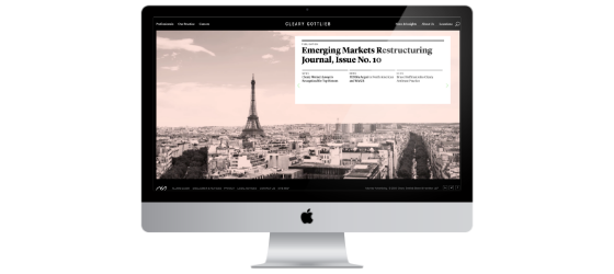
Cleary Gottlieb
The firm has two equal levels of global navigation separated by its logo in the middle and a terrific, yet traditional use of mega-menus that expand to reveal what’s inside. It is all intuitive and makes it easy to navigate and search specific sections (Professionals and News & Insights) – all from these cascading menus.
Goodwin
We called them a “stand-out firm” in the 2016 Study and noted the 2019 website above, but we are mentioning Goodwin again here. Kudos to them for its vertical-sliding navigation design on both desktop and mobile. Land on the home page and you’ll see two layers of global navigation: 1) a persistent vertical navigation structure with news, case studies and more and 2) the hamburger menu, which is organized by more expected navigation titles, such as Our People, Services, Publications, etc. As a visitor hovers over one of these sections, a “drawer” pops out to the right to reveal the “child” pages (i.e., it’s a like a drawer opening to the right). Some of the Services, for example, have another layer or drawer that pops out to reveal “grandchildren” sub-practice pages.
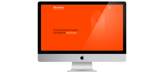
Akin Gump
We applaud the simplicity of this design, color palette and information hierarchy and how this beautifully transfers to mobile devices. From a navigation standpoint, the full-screen hamburger menu display is a winner – they plucked the desktop hamburger menu design and copied the look and feel exactly on the phone. Smart – this approach is well suited for the visitor that seamlessly uses all devices at the same time to find lawyers.
Mayer Brown
This is an excellent example of the “sticky header” on both desktop and mobile. We seldom see it on either and it is a strong anchoring element for visitors trying to get their bearings. It subtly acknowledges that we are all distracted, if not ADHD-afflicted, and it subconsciously calms us by saying, “It’s ok, we understand. We’ll make it easy for you to find what you need.”

Do's
| Do remember that navigation should be intuitive and designed to get a person from point A to point B. You are creating important journeys for your different visitor personas – guide them, make it easy for them to find their way. | |
| Do create the simplest taxonomy possible. If a visitor needs the equivalent of planes, trains and automobiles to access relevant content, you’re making it too hard. Be more critical of your taxonomy and content structure, then simplify. | |
| Do maintain navigation consistency across multiple devices. Your navigational menus should be blessed with great design. | |
| While hamburger menus on desktops are more popular than ever, do consider that vertical or horizontal mega-menus and cascading navigation can still play an important role in your strategy and design. There is a place for them – especially to display practice and industry lists, as well as locations. | |
| Do include global footers that include helpful and substantive info – these are easy ways to maximize the impact of important content that you want to appear on every page. | |
| Do include breadcrumb trails – it’s the modern-day GPS of your website and proves Hansel and Gretel were right. It’s the easiest way to know where you are and where you’ve been – especially for those visitors who use all devices interchangeably to search for lawyers and firms. | |
| Do use navigation and link titles that are easily understood. Include tiny intros of content when the links alone may not provide infinitely clear direction on what the visitor will receive when heading that way. This no-surprises approach will lead to website stickiness by encouraging additional clicks to that next piece of relevant content. |
Do use navigation titles or labels that are descriptive – each title must successfully and instantly communicate what’s inside. Descriptive labels are good for both search engines and for humans.
Don'ts
| Don’t include the word HOME in your global navigation. It hails back to the earliest days of website development before the logo on each page linked back to the home page. | |
| Don’t include more than seven primary global navigation sections. If you want to include several secondary options, be clear about the hierarchy of those compared to the primary titles and inform your visitor by designing them differently. | |
| Don’t get cute with your global navigation titles. Your titles are not the place to be unique; buyers of legal services want to view professionals, services, offices and maybe some trending news. Make it easy for them to intuitively navigate to these pages. | |
| Don’t use format-based navigation titles. What’s this? Navigation terms, such as videos, white papers, articles, etc. Visitors today aren’t searching for how information is formatted; they are seeking answers and relevant information. The use of these is evolving – we’ll see less and less format-based titles in new redesigns. | |
| Don’t forget that local navigation enables visitors to move horizontally through your website. When they are on your practice pages, in addition to “related” links or tabs of lawyers and news/publications, include links to all the sub-practices and industries. Designers are increasingly pushing back on including these today, instead favoring a cleaner page. There is a visitor-experience and cross-selling cost to not including them, however. | |
| Don’t forget the importance of FBP2 - Design when thinking through your navigation. Keep it simple and especially designed for each of the devices. (For example, ensure that phone navigation has space enough to accommodate large adult fingers.) | |
| Don’t forget that each local navigation page (especially tabbed content) should have a unique URL. This ensures that website visitors who use the “back button” in the web browser will be able to reverse in the same order they advanced and that your content on every tab is indexed by search engines. It’s just good rearview-mirror etiquette. |
The Nielsen Norman Group, the world leaders in research-based user experience, say, “Your users rely on link text to navigate through your site. These small and unassuming bits of UX copy contribute substantially to the findability, discoverability, and accessibility of your content.”
FBP3 Total Scores
Top Ten Performers
17 firms tied for first place so we are including all of them here.


