
AmLaw Global 50 Aggregate Scores
| # | Score | Description |
|---|---|---|
| 1 | 76.0 | Bold, distinctively branded layout and style |
| 2 | 74.0 | Strong imagery reinforces and advances firm brand and "story" - it's fresh and unique |
| 3 | 84.0 | Site is responsive with deliberately designed views for phones, tablets, desktop |
| 4 | 81.0 | Design is uncluttered and presents an intuitive information hierarchy |
Top Trends + Insights
The 2019 Global 50 firms were much improved on FBP2 - Design over the 2016 Study. The average of all 50 firms was 78.8 compared to 54.8 in 2016.
The redesigns have dramatically improved the scores for attribute #1 – “Bold, distinctively branded layout and style.” The average went from 61 (“fair”) in 2016 to 76.0 (“good”) in 2019. There is still plenty of room for improvement, though.
Most redesigns have adopted the “magazine-style” layout that gives visitors a lot of readily available content choices. (See the note about balancing images and fonts content below.)
Website planners and designers must anticipate what visitors want to see based on who your buyers are. Since visitors don’t read (they scan), the magazine-style layout gives them more choices and control over what they choose. Based on the analytics we track, this multiple-story layout on your home page (try it on interior pages, too) results in longer engagement and “dwell time” on your website.
Design on mobile devices significantly improved. In 2016 we called it a missed branding opportunity when the mobile version is an inferior skeletal version of the desktop site. But in 2019, the average of the Global 50 firms was 84.0, “good,” (compared to 41 or “poor” in 2016). Only one firm in this Study did not have a responsive website compared to 20 firms in 2016.
Rotating carousels are far less ubiquitous now than they were in 2016, but those that still have them present too much “it’s all about me” content. Meaning, mostly firm awards and rankings.
- If you are tempted to favor a carousel in your website redesign because you believe it can showcase all your practice and industry areas (and awards), resist.
- Carousel home pages are proven to be negative in three significant ways: user experience, SEO and consuming too much page real estate with content perceived as unimportant.
Carousels have been mostly replaced by the increasingly popular long-scrolling home pages.
In our website design work, lawyers either love the long scroll or vehemently oppose them, but there are practical reasons to consider them:
- In usability and user-experience focus groups and tests, visitors claim they want a greater sense of control. The scrolling home page gives them this, enabling them to travel at their own pace and consume more content without clicks.
- Respect your visitors’ time and elevate the clarity and authenticity of your own messaging and content.
- Scrolling home pages increase visitors’ “dwell time” and potential engagement with your content. They pick and choose things that interest them.
- Homepage carousels are known to have a negative impact on Google’s ability to crawl a site. They can also slow down site speed and don’t render well on mobile devices.
Information hierarchy for the Global 50 websites is stronger, better planned, and executed. The score for this attribute went from 64.0 (“fair”) in 2016 to 81.0 (“good”) in 2019. Imagery is also much improved. The litmus test is how well your imagery advances your brand and tells your story. In 2016, firms were not doing a good job – too many images looked like royalty-free generic clip art. They scored 53.0 then (“fair”) compared to 74.0 (“good”) in 2019.
Be careful to balance the size and style of imagery with font choices. We noticed several firms that had beautiful images, but they dwarfed the actual words on the page. The balance was way off.
Don’t fall so in love with your font choices that you miss problems they may present. Be careful that all your fonts render well in all browsers. We encountered several that didn’t display well in Firefox.
The same comment goes for design – don’t fall in love with it unless you know for certain it is accessible to visitors with disabilities. See FBP10 - Site Hygiene + Usability for a deeper discussion of W3C WCAG 2.0 & 2.1 compliance.
- All 50 firms failed to comply with accessibility standards.
- Design is one of three critical areas for accessibility testing. Pay attention to colors and contrast of text, links and any text that appears on top of images. Also watch font styles and weights – the thinner the font, the harder it may be to read.
- Confirm that any caption or text that appears on top of an image is highly readable from an ADA and accessibility standpoint. There were a lot of AmLaw Global 50 offenders.
- Ensure that every image (yes, this will number in the thousands) has alt-text associated with it. There is an alt-text compliance standard offered by W3C for what they call "decorative images." Quoting W3C: "Decorative images don’t add information to the content of a page. For example, the information provided by the image might already be given using adjacent text, or the image might be included to make the website more visually attractive. "In these cases, a null (empty) alt text should be provided (alt="") so that they can be ignored by assistive technologies, such as screen readers. Text values for these types of images would add audible clutter to screen reader output or could distract users if the topic is different from that in adjacent text. Leaving out the alt attribute is also not an option because when it is not provided, some screen readers will announce the file name of the image instead."
A lot of the images chosen by the Global 50 firms are not captioned or identified in any way and don’t differentiate one firm over another. Certain U.S. bar associations prevent the use of “stock” images showing stock people who are not the law firm’s lawyers (check with your bar associations before you lock in any imagery with people other than your own personnel). A group of stock people around a conference table tells us nothing about your firm and how it does business.
Speaking of images and design, beware of unconscious bias. When working with your designers, consider ALL your audiences and ensure that you are presenting your firm as open to all of them.
Use this cheat-sheet to confirm how comprehensive your choices must be: Age / gender / gender identification and expression / race / ethnicity / native language / culture / accessibility / disabilities / skill sets / religion / weight and height / sexual orientation / physical features.
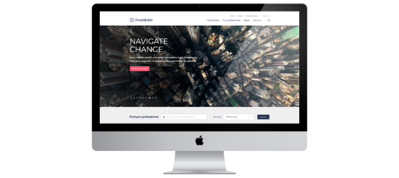
Still, too many home pages are not communicating firm strategy and other differentiating messages to the visitors (see the results and advice for FBP1 - Communicating your Message). You have 2-5 seconds to get your home-page message across – avoid throwing spaghetti-messages against the wall with the hope that something sticks.
Too few firms offer well-designed “print to PDF” options throughout their websites. On these sites, visitors are forced to use the browser-print for the page rather than dynamic, presentation-ready PDF pages (e.g., especially for lawyer bios, practice/industry and news/articles pages). Buyers of legal services do print the bios of lawyers they are evaluating, and often compare them side-by-side. Great design helps elevate the impact and memorability of your content.
- In 2019, 26 firms scored zero on offering the print-to-PDF functionality, which is worse than the 19 who received a score of zero in 2016. The remaining 24 firms scored 100.0 on offering print to PDFs.
Hamburger menus are more popular on desktop sites than ever before and it is a trend we fully support and see continuing. The mobile tail is clearly wagging and influencing the desktop dog. We counted 11 of the 50 firms that either use a hybrid navigation (hamburger plus other global navigation titles) or just use the hamburger.
- More-conservative lawyers are still hesitant to believe that “their” clients will like the hamburger menu (or know what to do with it). These lawyers are underestimating the currency and adaptability of “their” clients.
- We don’t recommend avoiding this now popular and streamlined menu trend. Jump on board!
We measured site speed and load time as a separate attribute under FBP 8 - Site Optimization and Online Search, but it also factored in here. It is proven that visitors abandon sites that take too long to load.
- The average page-load score on desktops for all 50 firms was 84.7. The fastest AmLaw Global 50 firm websites on desktop were Covington (99.0), Cleary Gottlieb (99.0), King & Spalding (99.0), Dechert (98.0), Baker McKenzie (97.0), Arnold & Porter (97.0), Squire Patton Boggs (97.0).
- And for mobile page-load speed, only two firms scored “excellent,” K&L Gates (94.0) and Covington (86.0).
Some mega-menus don’t work smoothly — they are jumpy, overly sensitive, disappear at inopportune times and often hide important page content. These are less prevalent with the increasing use of hamburger menus, but the firms that have them must ensure a positive user experience.
An important design choice to make relates to light mode v. dark mode (or what we might call “text reversed out of a dark background”). In 2020, dark mode is very popular and preferred by (at least) designers in various industries, but particularly the entertainment industry.
In the scientific field, bright text over a darker background, which we call ‘dark mode’ nowadays, is referred to as 'negative polarity'. Conversely, dark text over a bright background, which we refer to as ‘light mode,’ is known as 'positive polarity.' A study conducted by A. Buchner and N. Baumgartner back in 2007 argues that the human brain is predisposed to favor positive over negative polarity when it comes to focusing speed, concentration, and proofreading ‘performance,’ which has huge implications to our digital lives nowadays.
After all, the majority of things we do on our devices revolves around reading and writing text. Buchner and Baumgartner find that this is true regardless of ambient lighting, so no matter if it's day or night, light mode interfaces will allow you to focus faster on the text and display elements, whereas dark mode interfaces will make it a bit harder to distinguish text and visual interface elements, thus hindering your reading performance and ultimately straining your eyes.
Standout Firms
DLA Piper
A site with great organization and clear information hierarchy. DLA also stood out in the 2016 Study.
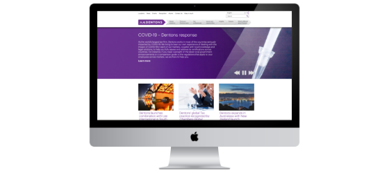
Dentons
Similarly, Dentons has designed a clean site with a focus on making it easy for visitors to navigate and find what they want. The dominant use of purple sets them apart. No hamburger menu here, but smart use of cascading mega-menus.
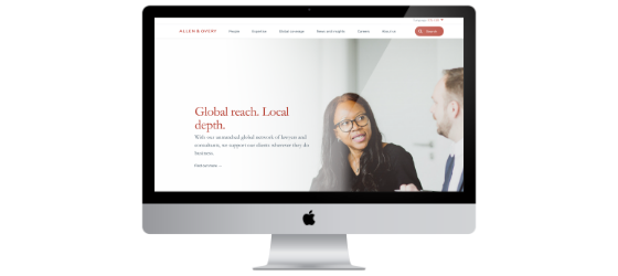
Allen & Overy
A highly approachable site, the home page is a stunning example of large panoramic images combined with large panels featuring geographic shapes. The large Chinese-red circle travels to most sections of the site as a recognizable link to Meet our People, Meet our Lawyers, etc. This site was the highest scoring site for FBP2 - Design.
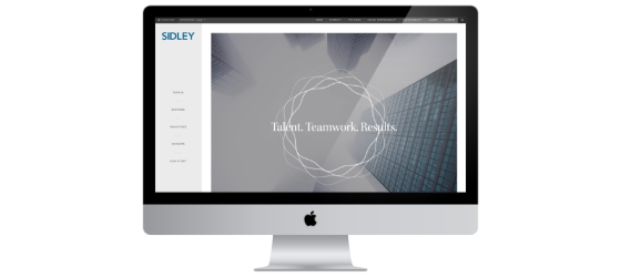
Sidley
The persistent global navigation on the left with the well-organized content and straightforward scrolling on the right is effective and easy to access. The bright colors against the gray work beautifully. Note how the story tombstones go from light mode to dark mode on hover. A good use of the dark-mode trend without sacrificing accessibility.
Freshfields Bruckhaus Deringer
Beautiful use of large images that add interest to their stories. One of the best “Our Thinking” sections in terms of presenting a lot of well-presented relevant stories and letting visitors peruse and choose. The images have energy (partly because of their consistent format and size) and uniformity. The combination of the vertical page scroll and horizontal feature scroll builds engagement.
Goodwin
Also called out in the 2016 Study, Goodwin’s site offers a smart use of the hamburger menu and navigation that cascades to the right (think of pulling out a “drawer” of information – and then another “drawer” for more detail). The bold, bright color palette is impressive and continues to electrify.
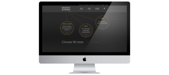
Winston & Strawn
Good interactivity and bubbles that engage the user – it’s graphically entertaining. Also a very good transition to tablets and phones from the desktop and laptop. Winston was also called out in the 2016 Study.
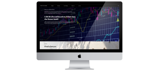
White & Case
This is a good example of a mostly dark-mode design. They have taken great care to ensure that most of the text is easy to read. (The only text that wouldn’t score well for readability is the light-mode panel on the home page, “Find a Lawyer.”) The details page design for the service pages is one of the best – engaging, appealing, comprehensive– with the large, color anchoring image that is stationary and the other image (black and white photos for related people and color images of other related material) and text columns that scroll.
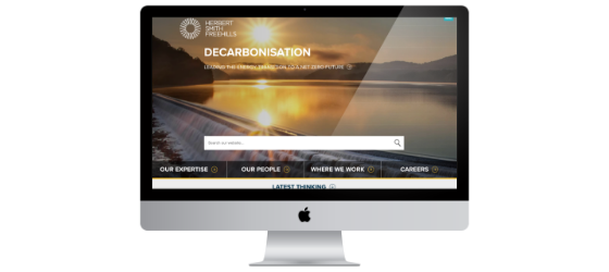
Herbert Smith Freehills
Easy to navigate, scroll and understand the information hierarchy. Effective, clean bio design with the large black-and-white portraits, clean layout and featured “Related Latest Thinking” underneath. The contrast of the black-and-white portraits with the bright pops of color and the color images accompanying news articles work beautifully.
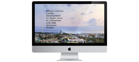
Milbank
A simple, clean site with a (mostly) two-thirds / one-third grid. The use of boxes and containers presented in light mode but distinguished by a light gray background or a white background is elegant and effective.
Do consider usability if you place your logo anywhere but on the left of the page. According to Nielsen Norman Group research, “Users are 89% more likely to remember logos shown in the traditional top-left position than logos placed on the right.” Brand recall improves if your logo is on the left.
Do's
| Do choose fresh, unique imagery that builds your brand and helps you tell a better story – and is more evocative for your visitors. | |
| Do aspire to simplicity — it works in your favor. Visitors want easy and clear access to information, and they want it fast. | |
| White may not formally be a color because it is the sum of all available colors, but in the context of your design, it is. Do treat the “white” (or unfilled) space as you would any other design element. Is there too much? Does it look too empty? Is there too little? Does it make the page look out of balance? The right balance of white space enhances comprehension of your important content. | |
| Do focus on information design. What is most important for you to convey? What is next most important? This design rigor will help your visitors feel at home on your site, regardless of the sections they visit. They will more easily find and better comprehend your key messages. | |
| Do design “consumables” on each of your pages. That is, use containers and boxes to effectively organize information. Callouts, sidebars, infographics, video and podcast features, and containers will get more attention than the long narrative text – the smaller bits of information will be easily consumed. Use them. |
Don'ts
| Don’t be afraid to choose and use bold colors – they add energy, personality and excitement to your brand. | |
| Don’t change the page layout and grid from section to section. It is jarring to visitors and creates a bumpy user experience. Typically, the two sections that are exempt from this best practice are Careers and News/Events. | |
| Don’t forget that all 50 AmLaw Global 50 firm websites failed the W3C WCAG 2.0 & 2.1 Level A accessibility – in part because of poor design choices. Alt-text on all images, appropriate contrast for text and links, and ensuring readability of captions/text on images are the place to start. | |
| Don’t discount longer scrolling home pages just because you (or certain lawyers) don’t like them. Focus on your visitors and what they need and want – and they want control. Give it to them. |
FBP2 Total Scores
Top Ten Performers
Five firms tied for 9th place so we are including all of them here.


